

-
-
-
- Resource files
- Velocity - How does it work?
- Quick Velocity Tutorial
- Debugging velocity scripts
- Velocity Command Reference
- Script Editor Tutorial
- Using velocity for calculations
- Using predefined forms in a html design
- Velocity forms
- Data field identifiers
- Macros and methods
- Velocity library
- Velocity: using the #macro command
- velocity and xml
- Using AJAX in your velocity scripts
-
Sections
A section defines, among others:
- a title
- a header
- fields to display
- a connected table
- a footer
You can show fields in your section that are owned by the class, but you can also show fields of related classes, defined by a relation in your data model (see "Relations between classes").
You can show one connected table in a section (also according to a relation defined in your data model)
Connected table in a section
The connected table in a section can be customized in a number of ways:
- How and if the details view of records can be opened
- If and how the table is grouped
- What records are displayed through use of a filter (learn more about filters here)
- If and how new records are added to and deleted from the table
- What columns are displayed in the table (learn more about setting columns of a table here)
- What actions are accessible (learn more about actions here)
Presentation
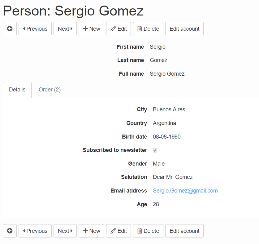
Sections can be presented in different ways with the property "Presentation".
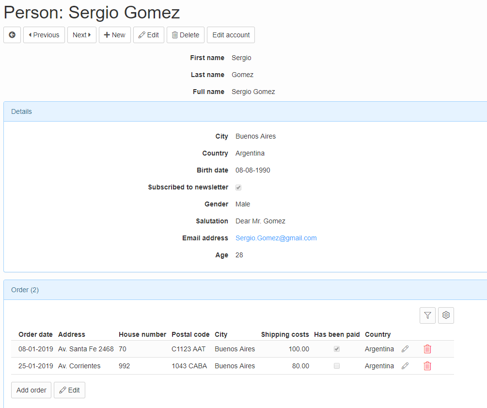
The most common presentations are "paragraph" (see image above) and "tab" (default, see image below).
Section visibility
Fields that are not part of a Section will be shown at the top of the screen above the sections. This behaviour can be changed by setting the 'Show fields that are not on a section' property.
Otherwise section visibility to different user groups can be set in the 'Visibility' tab. A filter can be added for more fine-grained control.
Read more about the security implications of section visibility on this page.
Width
In the layout of a section you have a couple of fields to set the width of the section:
- Width in extra small viewport
- Width in small viewport
- Width in medium viewport
- Width in large viewport
- Width in extra large viewport (from UIV 4.0)
These fields correspond with the following Bootstrap breakpoints:
extra small: ≥0       all devices
small:       ≥576     landscape phones
medium:      ≥768     tablets
large:       ≥992     desktops (and tablets in landscape)
extra large: ≥1200    large desktops
If the viewport (browser width in pixels) is smaller than the breakpoint, the sections will take full width and show below each other.
By default the large breakpoint is used. If you use a horizontal orientation, the sections are sized automatically. They appear next to each other when the viewport is wider than the large breakpoint.
If you want sections to appear next to each other on all devices; Use the width in extra small viewport.